05.01.21Greg Segel
EVOLVING A WEBSITE FOR A GROWING AUDIENCE

USA FREE SHIPPING $150+, FREE RETURNS & EXCHANGES

As an e-commerce company, a website is the most valuable asset. It tells your story, showcases your products, provides a great experience, and ultimately encourages purchases. But when you’re running 100 miles per hour building your company, how do you know if your website is doing all of those things well?
When I joined YORK Athletics in February, the website was a point of focus for me and I was able to provide a new perspective. After reviewing a paid social media campaign, we discovered we were driving a lot of traffic but our conversion rate dropped significantly. So we dug in.
First, we looked at our competitors’ sites. We focused on the user experience and how easy their sites were to navigate. We realized we were an outlier.
Three big discoveries came out of this exercise:
Now we knew what we had to change. We teamed up with Sparky, who has experience working with great brands like ’47 and Legends, to improve our user experience.
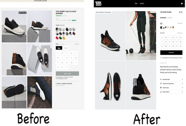
We started at the Top Nav bar because that’s where people look to shop and simplified the process:
→ Give the standard Men’s and Women’s options
→ Allow consumer to shop by activity
→ Showcase the perfect shoe with a beautiful landing page
→ Let our award-winning shoes do the rest

(Before)

(After)
Throughout that workflow we also focused on showing the dual gender and inclusivity of our product. The new imagery shows male and female models wearing the same shoes. We’re visually highlighting this unisex differentiator that makes YORK unique while giving customers an experience they’re familiar with.

Of course, with anything new there is a learning curve. Our loyal customers are extremely important to us and so we want to communicate with them along the way and allow for feedback.
And it is a journey. A website is never actually finished. It just goes live. With our new site we’ll have the ability to update our own content and A/B test and so the possibilities are endless for testing.
Our primary measure of success will be conversation rate. But other factors go into it as well, such as time on site, bounce rate, etc. Of course, nothing is done in a vacuum. Reduced time on site might not be a bad thing if people are more quickly getting the information they need to make a purchase. So we look at everything in totality.
That totality is the key. A website is many things and they must all be functioning together. I’m excited to see the impact these changes will have!
Greg Segel
V.P. of E-Commerce
By creating an account, you agree to the Terms and Conditions and Privacy Policy of York Athletics.