03.24.17Bold Apps
Designer Mike Kirtley talks about YORK’s overall design aesthetic and this season’s new Fighter's Edition Collection
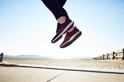
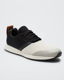
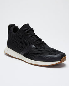
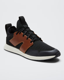
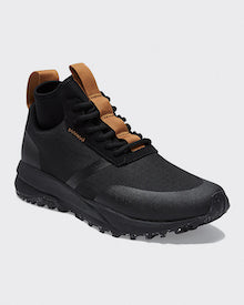
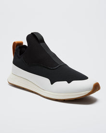
The YORK Athletics approach to product design is simple: no compromise on performance, achieving a clean and intentionally understated, minimally branded look by only focusing on what is necessary. In the new Fighter's Edition Collection, we cranked up our material design a notch by upgrading our mesh and adding a tumbled leather heel tab, making our signature minimal design more breathable and durable.
Performance footwear designer Mike Kirtley has 15 years experience designing footwear. He talks about the seasonal design inspiration and the balance between functional performance attributes and the Henrys minimalist and deconstructed design in this week’s Out of Step blog post…

YORK: This season’s design inspiration is “Blood, Sweat & Tears.” Can you talk a little bit about what that means from both a design concept as well as from an emotional perspective?
MK: We were inspired by the attitude and determination of people training for their own personal fight in life and by what the human body is capable of when pushed to its limits and how it responds to the physical and emotional stress that we put on it.
When I think about blood, sweat, and tears, there's an interesting contrast between the internal human motivation to strive and move forward versus what that fight looks like on a day-to-day basis, when you leave a little piece of yourself behind knowing that it's for some greater pay off.
Taking this fighting mindset we looked literally to blood, sweat, and tears to help inform our color and material palette for the season, with warmer, natural tones and full grain leather, invoking human passion and drive, contrasted with harder, colder tones and more technical, synthetic materials which represent grit and sacrifice.
YORK: Why are minimalism and deconstruction so important for YORK’s footwear design?
MK: Our first goal is to build products that perform at the highest standard and feel amazing on the foot. Having a lightweight shoe was always top of mind, so we took a minimal approach in order to save weight and to make sure the fit was perfect, with excellent flexibility and breathability. It’s important to us that there is nothing on the shoe that doesn’t need to be there, everything should contribute to a better experience for the user.
Secondly, we are confident enough in what our brand stands for that we don't feel the need to push a logo in anyone's face. This understated mindset allows the performance of the shoe and the attitude of the person wearing it to speak for itself.
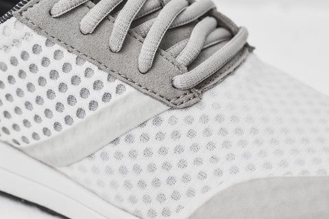
YORK: What makes this season’s technically soft, open air mesh so special?
MK: We are excited about the air mesh we are using this season. It's super breathable and has great physical properties but it is also dual-sided with a soft open hole structure on one side and a more durable monofilament surface on the other (monofilaments are extruded nylon fibers!). This allows us to flip the mesh in different areas of the shoe. For example, using the soft open side next to the foot in the toe box, eliminating the need for a separate lining, while the exterior benefits from the added protection and durability provided by the monofilament. This also gives us a really interesting visual aesthetic with an element of translucency, providing subtle shifts in color and tone.
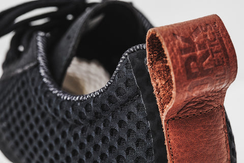
YORK: We’ve also added a tumbled leather heel tab to the Henry this season. How does that play into the seasonal theme and add to the Henrys durability?
MK: The heel pull on the Henry is an important detail. Changing it to leather this season was also inspired by our theme, which led us to introducing a rich, natural material to the mix. It's special since this is one of the main contact points of the shoe--an area you touch with your hands--this leather will wear and age really beautifully with time. I like shoes once they are well worn and showing the battle scars of the daily grind, it's when they have the most interesting stories to tell!

YORK: What other design details reflect the Henrys minimal design aesthetic?
MK: Like I mentioned above, one of our key goals when designing the Henry was to reduce the number of overlays and unnecessary construction. But as with everything in life, it's a case of finding a balance. By having a couple of strategically placed seams, it allows us to build an upper that takes the three-dimensional shape of our custom last much better than if we had tried to use just a single piece. Not only does this help our product fit and perform better, it also helps us with efficiency in our manufacturing process.
Mike Kirtley is a multi-discipline designer, creative director, and innovator. To learn more about him or his work, check out his website below. Mike also founded a side project called Amateur Cooperative in 2014, a rider-owned lifestyle mountain bike brand with the mission to drive opportunity and collaboration in the mountain biking community and others like it. Check out Amateur Cooperative's website and Instagram feed below.
